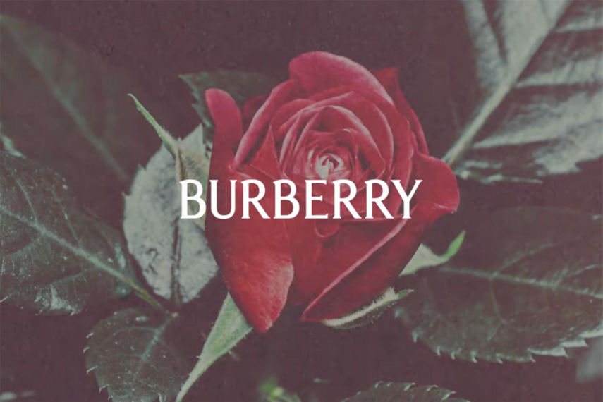
The luxury fashion house revealed a modernised logo.

In the blink of an eye, Saint Laurent, Balenciaga, Burberry, Berluti and Balmain popped into an homogenous sans-serif splodge. Minimalist by design, and spurred on by a desire to fit digital mobile devices, the world of luxury fashion “rebland” made the world sigh at the sea of sameness.
When Burberry’s new chief creative officer, Daniel Lee, presented his creative vision earlier this week (6 February), it was a well-needed breath of fresh air. With an evolved take on Burberry’s 1901 equestrian logo and a return to a more subtle serif-style font, Lee is acutely aware of what people want. He adds texture and uniqueness, rather than taking it away. It reminds me of Guinness when it chose to add more detail to its golden harp.
Like the knight in the logo, flying a flag fluttering the Latin word prorsum (meaning forwards), Lee’s direction takes Burberry on a charge. This ad, shot by Tyrone Lebron, blends Burberry’s heritage beautifully with pop photography, embedding the logo in non-classical compositions.
Nothing says goodbye to Burberry’s sans-serif era like wiping its social media clean (a tactic used by Lee previously at Bottega Veneta). So far, so good.
Brand Burberry
Title “Creative expression”
Agency in-house
Director Tyrone Lebron

