As the cliche goes, it’s what’s on the inside that counts. But when it comes to products on the shelf at the grocery store, McCormick, the world’s largest spice brand, knows the outside matters a lot. The company recently overhauled the design of its well-known spice containers for the first time in 40 years—and it’s making every change count.
The new McCormick spice bottles, explained
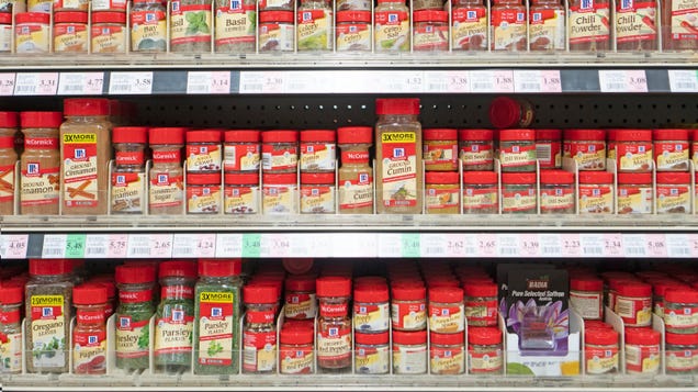
McCormick spice bottles are usually best recognized by their bright red cap, the cream-colored label, and the red ribbon around the neck of each bottle that sports the brand name. The new bottles still feature that same red, but with some tweaks.
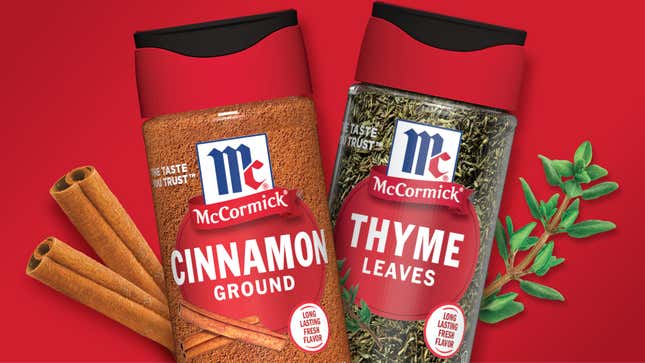
As the press release explains, the redesign aims to highlight the brand’s emphasis on the freshness of its spices. Most notably, the signature red shaker caps will be replaced—the cap will still be red along the sides, but with a heavy-duty black lid on top, a “SnapTight” lid that “[locks in flavor and freshness between use.” The cap also now has a “best by” date stamped onto it, though we’d like to remind you that this date might not mean much.
The actual shape of the bottles has also changed. Previously the taller spice containers were tapered at the top, which created the neck of the bottle and a round base. The new design is just a straight-walled cylinder.
As for the graphics on the bottle, McCormick has done away with the red ribbon and opted for a transparent and minimalistic label that features the brand’s logo, the product name, and yet another reminder of “FRESH FLAVOR.” The new bottles have already begun to hit shelves for McCormick’s most popular products, including Cinnamon, Garlic Powder, Paprika, Parsley, and Crushed Red Pepper.

Why are McCormick spices getting a redesign?
The spices, it should be noted, are not getting a new formula. However, Nikki French, vice president of marketing for McCormick, explained to CNN the purpose behind each design update and how each will benefit consumers.
The new snap cap, for example, will allegedly block out more oxygen, which is a key factor in how fast our spices go stale. French also noted that McCormick has implemented a new manufacturing process that pushes air out of the bottles when filling them with product, which will also help with freshness. Clearly, consumers place a lot of value on freshness, and McCormick is eager to prove itself in this regard.
Many of the design changes also appeal to our senses to demonstrate the quality of the spices. For instance, when the new caps are closed, the satisfying snapping sound of the cap signals that nothing’s getting in or out of that bottle. The transparent label, meanwhile, lets consumers see more of the actual product inside the bottle.
French told CNN that McCormick is “very confident” about the redesign and has already seen positive results from consumer product testing. McCormick’s own consumer research indicates that customers have chosen the new bottle twice as much as the old one, and yes, their perception of the product’s freshness has increased as well.
Despite the sound reasoning behind these changes, the nostalgia addict in me longs for that simple red cap and old-timey lettering. This new aerodynamic-looking bottle doesn’t scream “home cooking” to me, but it’s not necessarily trying to look warm and inviting. It’s trying to look bolder, fresher, and more eye-catching than the competition.

